
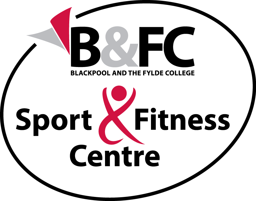
Below is a logo for the Sports & Fitness Centre at B&FC. The adapted ampersand makes the athlete the focal point of the design.
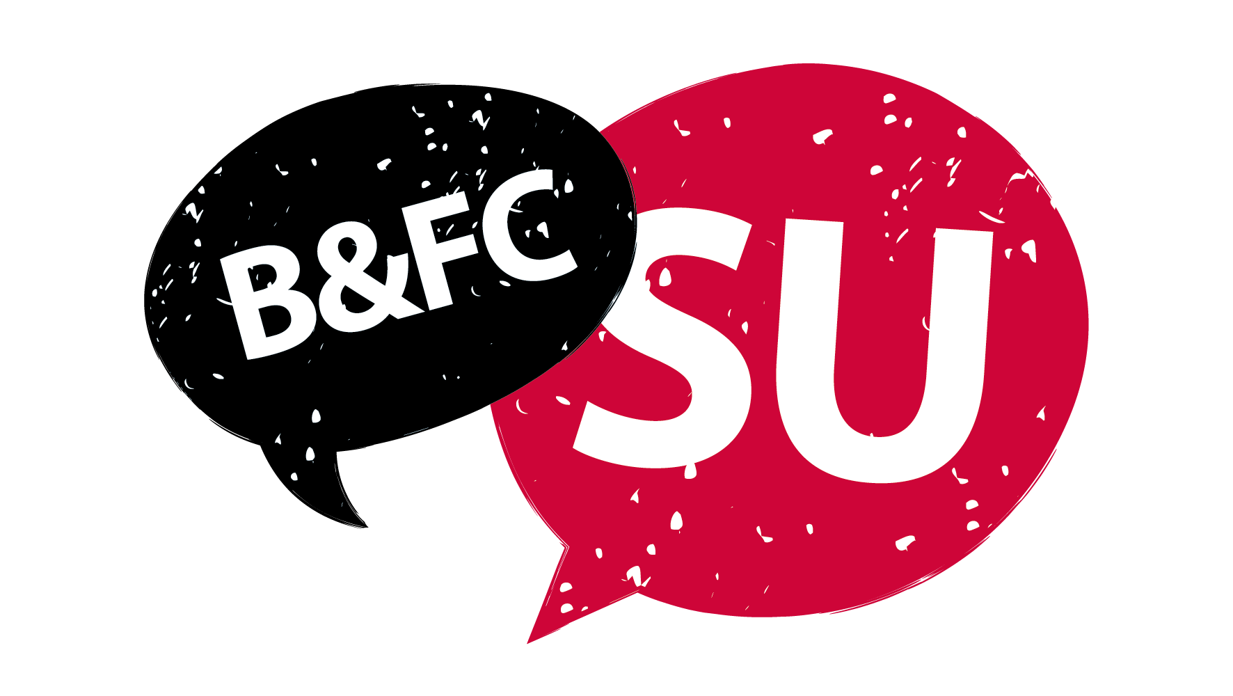
I was asked to create a new logo for the Students Union at B&FC. It's a simple solution in their brand colours to convey the importance of communication.
Below is a logo developed for a proposed project. The abbreviation is drawn as three icons representing medical, engineering and energy.